Color Poem
This website was inspired by a color poem. It features the complementary colors of pink and green. It is intended as a space to enjoy, interact, and experience colors on screen, but as also place to inform on complementary colors and accessible design that considers color.


While working on this project, I used my knowledge from multiple previous classes that I have taken before. One of those classes was Two-Dimensional Art & Design. I was able to use many different shapes and lines in the space of my website. I was also using my knowledge of contrast and color theory to allow the audience of my website to be able to read and understand my website. I also used knowledge from my Typographic Design class with the use of appropriate typefaces and font sizes to show typographic hierarchy within my website. I was also able to use my knowledge from that course to use grids as a tool to lay out my design. I had to do additional research beyond my existing knowledge because I did not know much about accessible design. I now know how important it is to check to see if everyone was able to see and read my design.
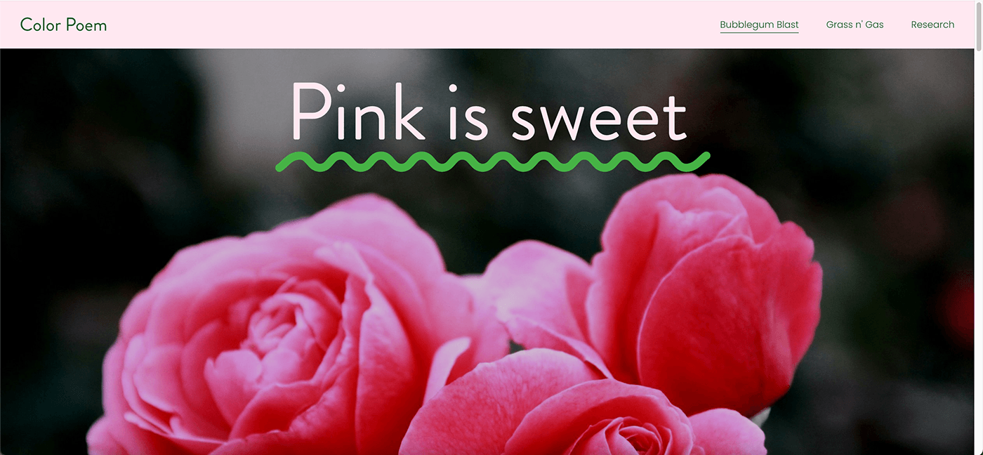
I chose to communicate my knowlede of color theory by showing the two colors, pink and green, as complete opposites in their personalities since they appear to be opposite from each other on the color wheel. I explained their personalities so that pink was more calming and positive while green was more disgusting and negative. However, as they are on the website together, they can work well as a team and support each other. This project allowed me to better understand how a website should be designed. As a graphic designer, website design is becoming more and more relevant in the field
to show off many different types of brands.
to show off many different types of brands.

